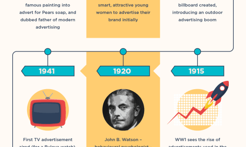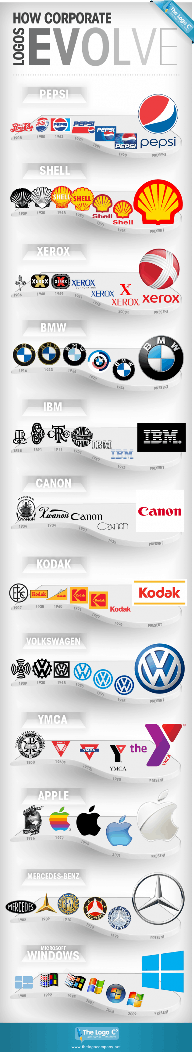

For today’s infographic, we have a look at the changes of various corporate companies over the years. No, it’s not about their trends of success or the quality of their products. This infographic is about what most people subconsciously relate to a company image: The Logo. You could have the worst or the best company or commercial service in the world, but if you don’t have a recognizable and simple logo, you don’t stand a chance with identifying with the consumer market. What a logo creates is something that people don’t really think about; a face to go along with a name. It creates the idea of craftsmanship and identity in a post-industrial world.
It’s interesting to notice how the late 19th/ early 20th century logos used to be much more detailed and with a sense of personality. Visual modernism and minimalism obviously became more prominent as the years have passed, but in almost all of these logos I prefer the first images the most (I do like the new Pepsi logo for some reason though). It’s funny how design trends for well-established companies seem to get lamer as the years go on. I guess the sense of personality slowly wears down as their respective progenitors leave or pass away. Meh, food for thought.
UPDATE:
I’d like to personally apologize for how inaccurate and riddled with typos this infographic seems to be. I obviously didn’t not proofread closely enough to notice the mistakes the first time around. This is a lesson for me for doing my research before submitting. I’ve been extremely busy the last few days and did not devote enough time to find an infographic cut to the standards that we here at the daily infographic stand by. Again, I sincerely apologize.
[via]