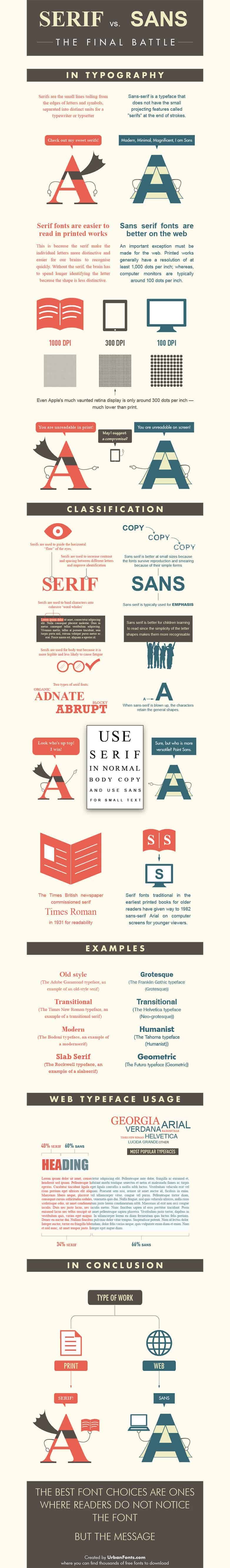

A composition written with the intention of sharing an idea to a broad audience should have the immediate focus be the message, not necessarily the writing style or formatting. This is a concept often forgone in world of media exposure. Advertisements, blogs, newsfeeds, email, and other forms of easily consumed information weâ??re bombarded with intentionally draw this attention toward stylistic variance and recognition, so as to instill a presence within a written work without having much, or any true content.
This recurring equation for convenient content will waste an audienceâ??s time, and rob them of information, in a somewhat-deceptive way. A variety of techniques can be used to either add to the impact of meaning, or detract from it. One method for enhancing a message is to make sure the script itself is palatable to the eye, and not an interfering factor. Here, font and structure play an integral role in the flavor of a message.
Choosing font styles while creating an emblem of communication will have an incredible influence on the reader. I donâ??t remember ever using fonts like â??Windingsâ? or the ever berated â??Comic Sansâ? for any sort of writing Iâ??ve ever done, arenâ??t I cool?