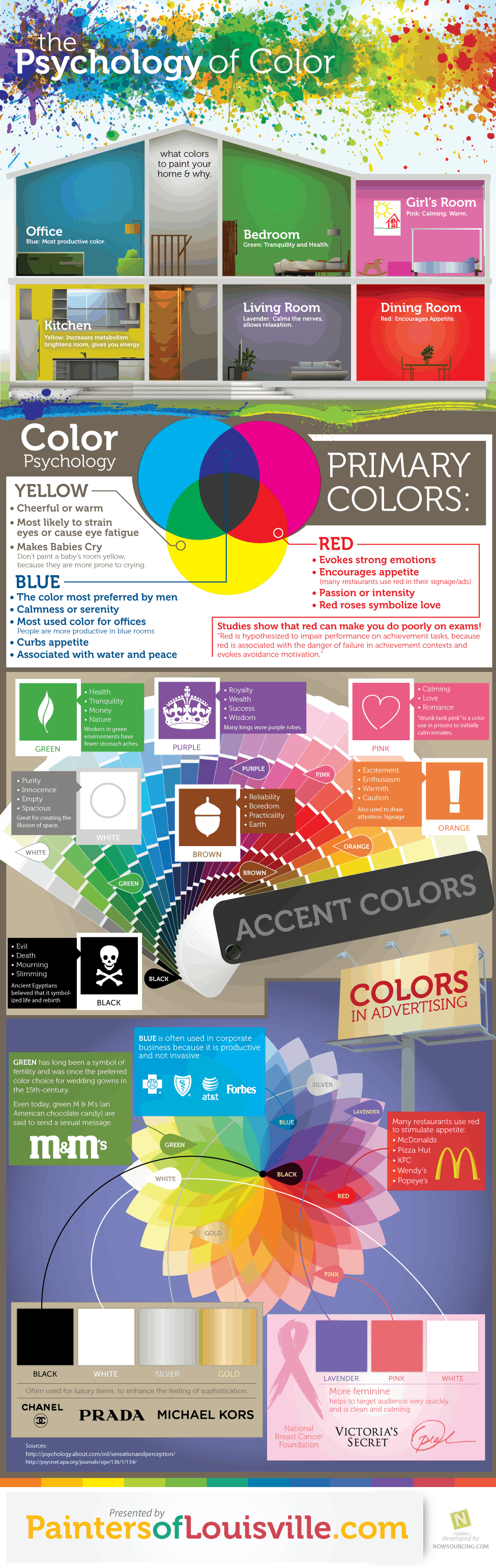

The psychology behind color has been well documented. Red makes you hungry, pink rooms calm you down, and green is very tranquil. Today’s infographic does a very good job of breaking down the primary and secondary colors that affect us the most and in what ways. The infographic starts off by informing the reader on what colors suit certain rooms the best. From there it goes more into the psychology of the primary colors, divulging a secret unknown to me. Babies don’t like yellow.
Why does the color red make you hungry? Is it just because all the fast food restaurants banded together to create that color association? Researchers are actually in agreement that warm colors like red and yellow increase the heart rate and hunger as a result.
It also speaks on how companies use a given color to pull at our heartstrings and wallets for their own gain. Enjoy the infographic below and let us know your favorite color. I like purple. [Via]