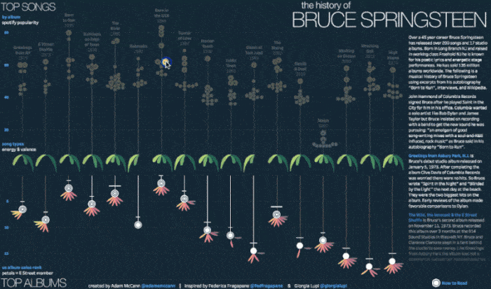
What if you took the raw data surrounding the career of a legend like Bruce Springsteen and used it to create a beautiful homage? Any music lover knows that it’s impossible to distill the joy of music down to facts, figures, and numbers. After all, it’s more magic than science.
However, that’s precisely what Adam McCann did with this visualization, which details every single song ever recorded by the Boss. Over the 45 years (and counting) of Springsteen’s career, he recorded over 200 songs and 17 albums, thus providing a treasure trove of data to analyze.
The infographic classifies albums by Spotify popularity, an interesting measure, since Spotify is a relatively recent invention, making these statistics a solid demonstration of which albums have stood the test of time. Perhaps unsurprisingly, nothing comes close to 1984’s “Born in the USA,” and 1975’s “Born to Run” is a close second. Curiously, 2014’s “High Hopes” is not among the highest ranked, despite having been released at a time when Spotify was already popular, and a relatively smaller percentage of listeners would choose to buy a physical record instead.
Interestingly, the infographic also analyzes songs by energy and valence, demonstrating that high energy, low valence songs seem to be the most popular. Overall, it’s a fascinating visual representation of a legendary music career and a great example of how eye-opening data can be.


