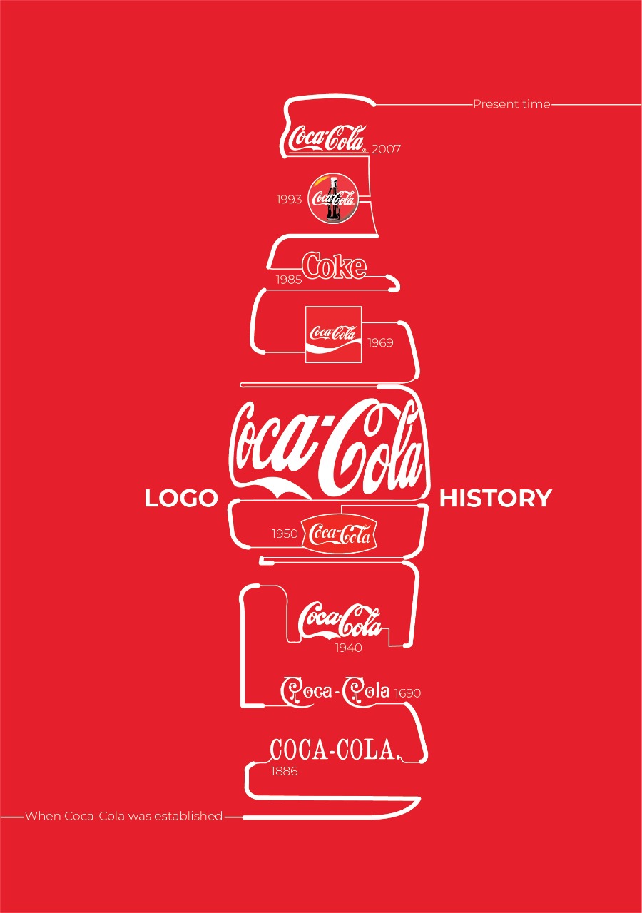

The Coca-Cola logo is one of the most recognizable logos in the world. The simple design has been used for over 100 years, and it’s changed very little over time. Here’s a look at how this iconic label evolved into what we see today.
The Coca-Cola logo has undergone many changes over the years.
The first version was created by Frank Mason Robinson and John B. White in 1885, but it wasn’t until 1916 that we got our first glimpse of the current Coke logo. In 2003, the Arnell Group created a new design for Coca Cola that includes some new elements like cursive lettering, which replaced thin block letters from previous versions of the logo. At the same time, they also introduced some new colors and fonts to reflect modern tastes and trends in branding.
The traditional red color scheme has remained relatively unchanged since then but there have been other subtle tweaks over time as well as dramatic changes like switching out all caps letters for lower case ones (and vice versa).
The Coca-Cola logo has undergone many changes over the years. It started out with a simple script and later moved towards a more modern design without losing its iconic shape. Even today, Coca-Cola continues to use the same basic red and white color combination for its label that we’ve seen since 1886!