
In our busy everyday lives sometimes we overlook important things, including our nutrition. Today’s infographic will give some very valuable information about how to eat a healthy and balanced meal.
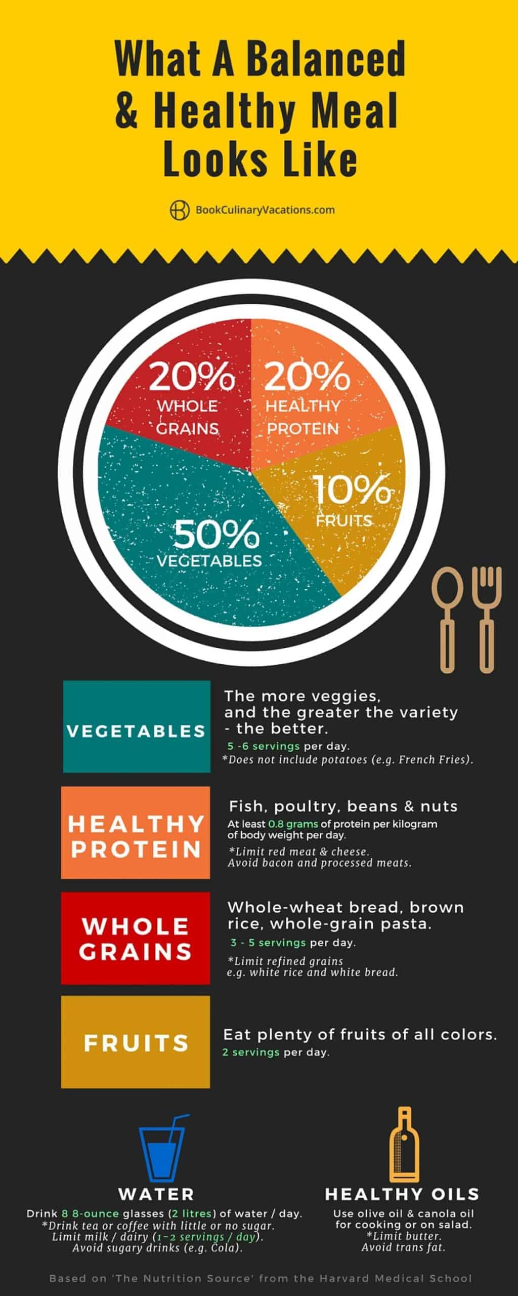
Today’s infographic shows what an ideal balanced and healthy meal looks like using a plate that also doubles as a pie chart. It is evident from this infographic that the saying “Eat your veggies” is a crucial one to live by, as a balanced and healthy meal ideally has 50% vegetables. While the other staple food groups are essential, you should clearly prioritize eating vegetables over everything else.
Not only does this infographic break down the ideal meal, but it also informs the audience on what to avoid, from refined grains to sugary drinks. Each of these can heavily affect the overall nutrition of a meal–especially sugar–which is addictive and hidden in many of the foods we consume every day.
Last but not least, this infographic also includes two vital parts of our diet that are not necessarily their own food groups: water and healthy oils. It informs the audience of the ideal amount and way to consume these two alongside the rest of the food groups.
While for most people these exact percentages will vary, this infographic does a solid job at giving the general rundown of what a person’s diet should look like.