
William Shakespeare once famously asked, “What’s in a name?” We may not have the answer, but it does raise another question: What’s in a picture?
This infographic examines the logos of the world’s top brands to see what they have in common. Whether you’re a graphic design nerd or a new business owner, read on to find out more about the traits of success.
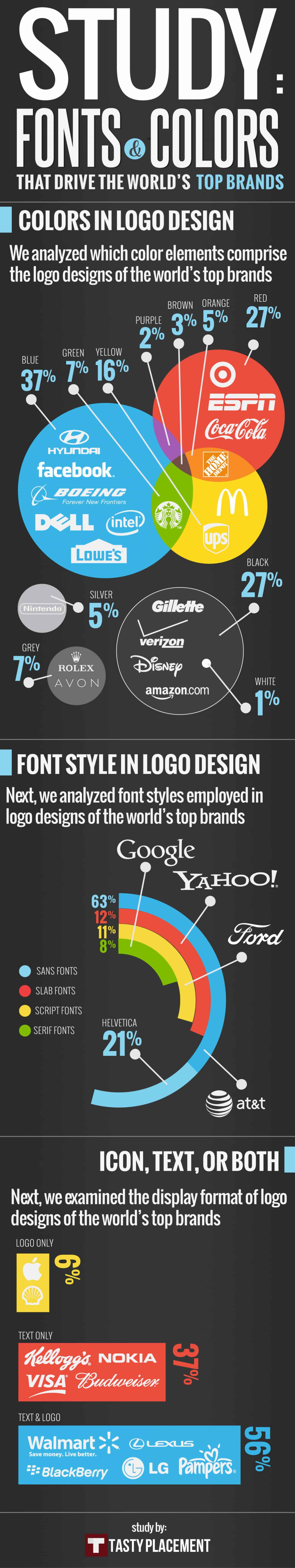
Blue is, by far, the most popular color for successful companies. Hyundai, Facebook, Boeing and Lowe’s are just a few of the businesses that have incorporated this power color into their logos. Black and red are also popular choices. On the other hand, it’s best to stay away from brown and purple.
For all of our font geeks, we’ve got some interesting news: Sans serif fonts are the way to go if you’re designing a successful logo. Serif fonts were found in only 8% of the logos that were examined.
Lastly, most companies choose a picture and text for a logo. The companies that opt for a picture on its own also have high brand recognition, like Apple and Shell.
Text and colors aren’t the only thing to consider: How does your target audience affect your ideal design? Click here for the answer.