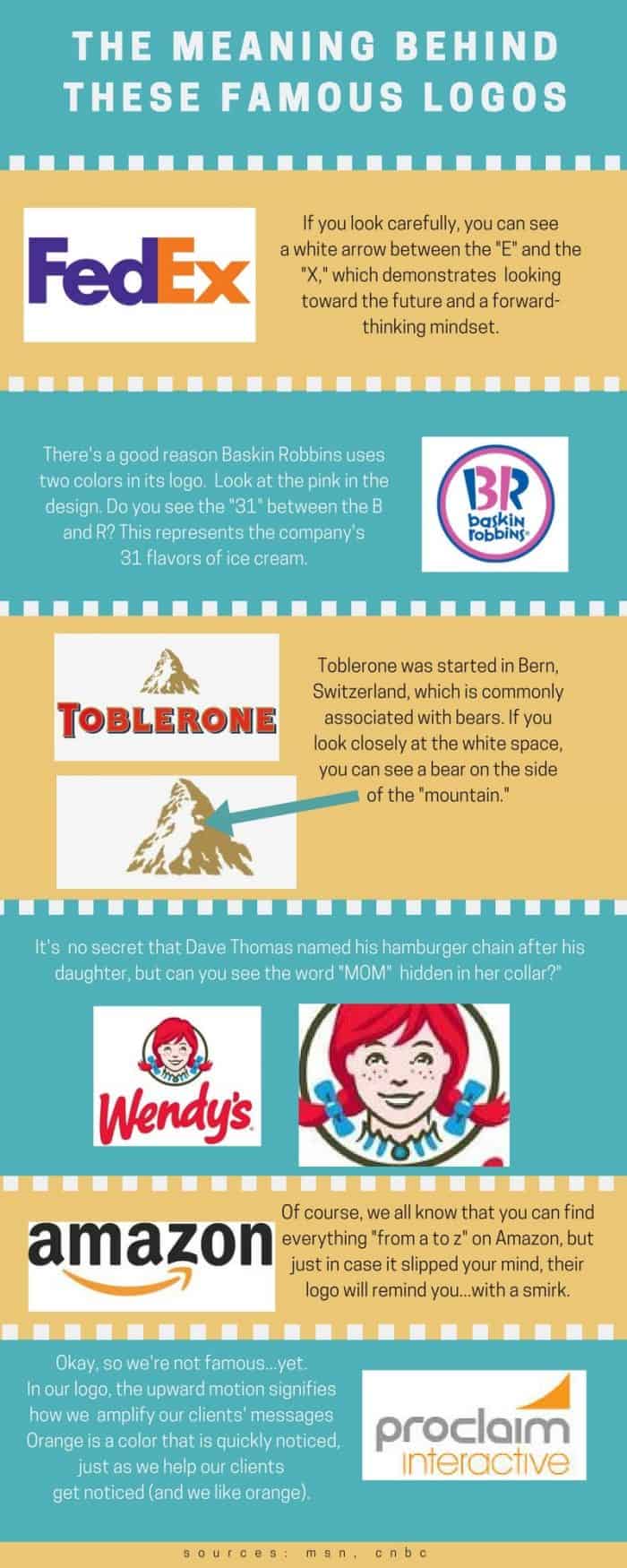
I’ve never been good with optical illusions or puzzles, so I hate trying to find hidden meaning in pictures. Thankfully, this infographic makes it fun and easy to learn the real intent behind some of the world’s most popular logos.
The FedEx logo, for example, doesn’t look like anything special at first glance. But if you look at it closely, you’ll see an arrow in the white space between the last two letters. The business says it demonstrates a forward-thinking mindset.
Baskin Robbins takes a similar approach. Its two-toned logo isn’t just a design choice––the pink parts of the logo spell out “31,” the number of ice cream flavors the company has.
While we’re on the topic of sweets, let’s chat about Toblerone. The brand has a bear hidden in the white space of its logo.
I’m a fan of Wendy’s when I want cheap fast food, but I’ve never noticed the secret message in its logo. Wendy actually has the word “Mom” written in her collar.
If you want more of these mind-blowing logo messages, check out our post about 40 brand logos with hidden messages.

