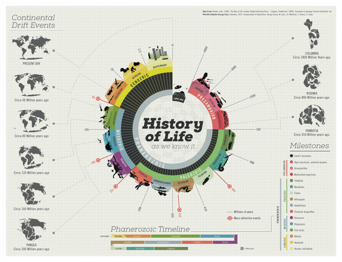
History has always been that one mundane subject no one wants to study due to its complex nature and sheer uselessness. But what if all that “history stuff” wasn’t all that difficult and boring? Is there some way to make history fun? Well, yes, there is, and infographics are a great example of it. With the information provided, there are a lot of fun jumping-off points. Here, you can learn more and discover some unique facts.
Through the illustration, you and I can observe how truly easy it is to comprehend our development in the sands of time. For example, no one knows how the earth looked 200 million years ago or the different stages of the Phanerozoic timeline. The infographics accurately identify the different milestones in the development of our planet that have altered the course of life on earth and document it in a straightforward fashion.
From the first extinction in the Paleozoic period to the mass extinction event that killed the dinosaurs, the infographic also records several mass extinction events that have shaped our planet through millions of years. It is interesting to see how these various events have had a catastrophic impact on life on earth and have continuously changed the landscape we live in.


