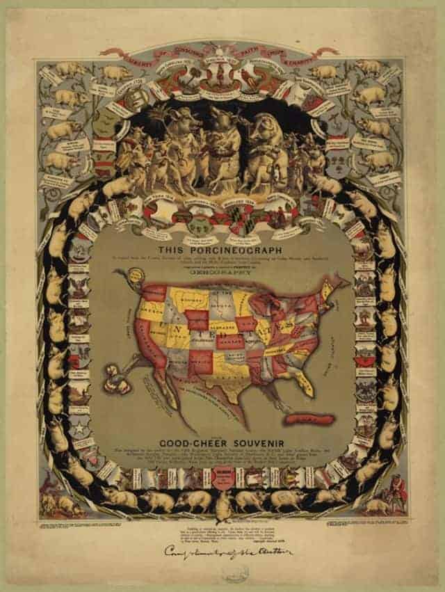

In 1875, before the term infographic was ever coined, quirky millionaire William Emerson Baker commissioned this beautifully illustrated map titled “The Porcineograph”. This map serves as an infographic in two ways. The first being the actual information it displays. Along the border you’ll see a depiction of the pork-centric dish that each state was known for at the time.
The second source of information this map has to offer is the historical context it was created in. This was before the publication of Upton Sinclair’s “The Jungle”, which was the book that stirred a huge called to arms for stricter regulation in the food industry. Up until that point meat packing plants were shipping out some pretty disgusting stuff. Baker gave this map out as a souvenir for guests of his launch party for the “Sanitary Piggery” which is pretty much exactly what sounds like — a clean and hygienic hog farm.
In the bottom corners you’ll see illustrations of pig related incidents that influenced change in US legislation. Alternatively, this map also serves as precursor for important changes in legislation to come. Even if you aren’t interested in brushing up on your food industry history, this thing offers some other fascinating oddities like how Hawaii was referred to as “Sandwich Islands” and that people in New York were apparently consuming “uninvestigated drinks.”
Click here to view a larger image.